

Pressing, Defensive Lines, and What Defensive Actions Correlate with Goals
/By Cheuk Hei Ho (@Tacticsplatform)
How do you analytically measure a high defensive line and defensive pressing (see StatsBomb pressing index and Jamon's piece from a couple weeks ago)? Do we have enough data and information to analyze this behavior? If we do, how do these tactics impact the performance of a team?
Indexes to Measure Pressing
I used several indexes to measure the level of defensive pressure and the location of the defensive lines for every team in MLS. The first set of the indexes assessed how high (or low) a team holds its defensive line; I calculated the average locations of tackles, interceptions, and challenges. I also included the location of the opponent’s throw-ins because a tackle can often result in the ball going out of the touch (@RabonaQuimby suggested this measure). These measures assume the higher the defensive line a team holds, the farther these defensive actions occur from its own goal.
The second set of the indexes estimates how much defensive pressure a team applies. I calculated the ratios of the above defensive actions to the number of the opponent’s passes. This step normalized how many defensive actions a team applied when the opponent had a standard amount of possession. I also used the opponent’s behaviors to infer the amount of pressing a team implements. As a pressing team looks to close-out or attack a ball handler immediately, the pass success rate should decrease when a player is pressed. The ball handler also often needs to use a long pass to bypass the immediate pressure. Short passing success rate in the middle-third of the field and pass type distribution in the defending-third estimate these behaviors:

A scatterplot of the average frequency and location of tackles per game for each MLS team. The frequency is measured by dividing the total number of tackles by the number of opponent's passes. The more frequently a team tackles, the larger the number. The larger the number, the further away from a team's own goal.
The size and color of the dot indicate on average, how much xG a team creates and suffers, respectively. So RSL, a team with a tiny dot that is dark red, creates very little xG, while allowing a lot. Conversely, Atlanta, with a large light yellow dot, creates a high xG number, while denying their opponents' xG.
So teams in the upper right like the New York teams tackle far from their own goal, and have a high ratio of tackles to the number of passes they allow their opponents. Teams like San Jose and Vancouver have a smaller ratio of tackles to passes allowed, and the tackles take place close to their own goalline.

This is a scatterplot of the average frequency and location of tackles per game for each MLS team. The larger the number, the further away from a team's own goal.
The size and color of the dot indicate on average, how much xG a team creates and suffers, respectively. So RSL, a team with a tiny dot that is dark red, creates very little xG, while allowing a lot. Conversely, Atlanta, with a large light yellow dot, creates a high xG number, while denying their opponents' xG.
So teams in the upper right like New York and Kansas City have a high number of interceptions far from their own goal. Teams in the bottom left, like DC and Dallas have fewer interceptions and they're closer to their own goal.

A scatterplot of the average frequency and location of challenges per game for each MLS team. The frequency is measured by dividing the total number of challenges by the number of opponent's passes. The more frequently a team challenges, the larger the number.
The size and color of the dot indicate on average, how much xG a team creates and suffers, respectively. So RSL, a team with a tiny dot that is dark red, creates very little xG, while allowing a lot. Conversely, Atlanta, with a large light yellow dot, creates a high xG number, while denying their opponents' xG.
So New York Red Bulls have a high number of challenges to passes allowed, and those challenges occur far from their own goal. NYCFC has an astronomical number of challenges per allowed passes, but they occur about an average distance from goal.

A scatterplot of the average frequency and location of opponent's throw-ins per game for each MLS team. The frequency is measured by dividing the total number of opponent's throw-ins by the number of opponent's passes. The more frequently a team opponents have throw-ins, the larger the number. The larger the number, the further away from an opponent's goal.
The size and color of the dot indicate on average, how much xG a team creates and suffers, respectively. So RSL, a team with a tiny dot that is dark red, creates very little xG, while allowing a lot. Conversely, Atlanta, with a large light yellow dot, creates a high xG number, while denying their opponents' xG.
The New York teams both have a high portion of opponent throw-ins to passes, while Philadelphia and LA Galaxy have very low ones.

A scatterplot of the average opponent's short pass success in the mid-third and opponent's frequency of long passes originated from the defensive third for each MLS team. The average opponent's short pass success is the fraction of short passes a team's opponents successfully make in the mid-third. The more short passes they complete, the larger the number. The opponent's frequency of long passes is the % of long passes a team's opponents make in the defensive third. The more long passes they attempted, the larger the number.
The size and color of the dot indicate on average, how much xG a team creates and suffers, respectively. So RSL, a team with a tiny dot that is dark red, creates very little xG, while allowing a lot. Conversely, Atlanta, with a large light yellow dot, creates a high xG number, while denying their opponents' xG.
NYCFC allows its opponents to complete the smallest portion of short passes in the middle-third of the field, and their opponents attempt a larger portion of their total passes in the defensive third than any other team.
Most indexes show that both teams in New York and Sporting Kansas City hold the highest defensive lines and apply the strongest defensive pressure in the league. New York Red Bulls are outstanding; they are first in seven of the ten measures. These observations fit the eye test; all three teams press high in the opponent’s territory when out of the possession. Moreover, although New England isn't impressive in the amount and the location of the defensive actions, they are close behind the above three teams in the disruption of the opponent’s passing behaviors. One surprising result is that Atlanta United, widely lauded for their high-pressing tactics, rank around average in most indexes. The most convincing pieces of evidence to support such tactics seem to come from traditional tactical analyses with video highlights, but it is also possible that these indexes don’t describe all high-pressing behaviors.
The Red Bulls’ Dilemma in High-Pressing
As evidenced by the indexes above, the New York Red Bulls have the most intensive pressing in the league. They are not only good; they are excellent, way ahead of everyone. But how do their pressing tactics impact their performance?
This is an important question, because our measures – or most soccer analytical measures – suffer from the same limitation that they can only describe the behavior of a team. They can’t address whether it is an action or a reaction. For example, we cannot determine whether the Red Bulls cause the opponent to play longer passes because they want to force it to do so, or the opponent wants to use the long ball to bypass their defensive pressure. Therefore, I use correlation analyses to examine how the defensive pressure impacts the quality of chances (expected goals, or xG) one team creates:

A correlation plot of the frequency of tackles and xG a team creates for every team in MLS. The range of correlation coefficient (r) ranges from -1 to +1. +1 indicates a perfect positive correlation between the tackle intensity and xG creation (one goes up the other also goes up). -1 indicates a perfect negative correlation between them (one goes up the other goes down). 0 means there is no relationship between them.
So Orlando City's tackling intensity is closely correlated with their chance creation, while San Jose's tackling intensity is correlated with them creating fewer chances.

A correlation plot of the location of tackles and xG a team creates for every team in MLS. The range of correlation coefficient (r) ranges from -1 to +1. +1 indicates a perfect positive correlation between a higher tackle line and xG creation (one goes up the other also goes up). -1 indicates a perfect negative correlation between them (one goes up the other goes down). 0 means there is no relationship between them.
When Kansas City attempts their tackles higher up the field, they are more likely to create expected goals. When New York attempts their tackles up the field, they are less likely to to create expected goals.

A correlation plot of the frequency of interceptions and xG a team creates for every team in MLS.
When Real Salt Lake has a high ratio of interceptions to passes allowed, they also create more expected goals. Orlando is the opposite; a higher interceptions to passes allowed ratio leads them to create fewer chances.

A correlation plot of the location of interceptions and xG ca team creates for every team in MLS.
For most teams, the farther from their own goal they intercept the ball, the more likely they are to create expected goals. For Seattle, Orlando, the Galaxy, and DC, the opposite is true.
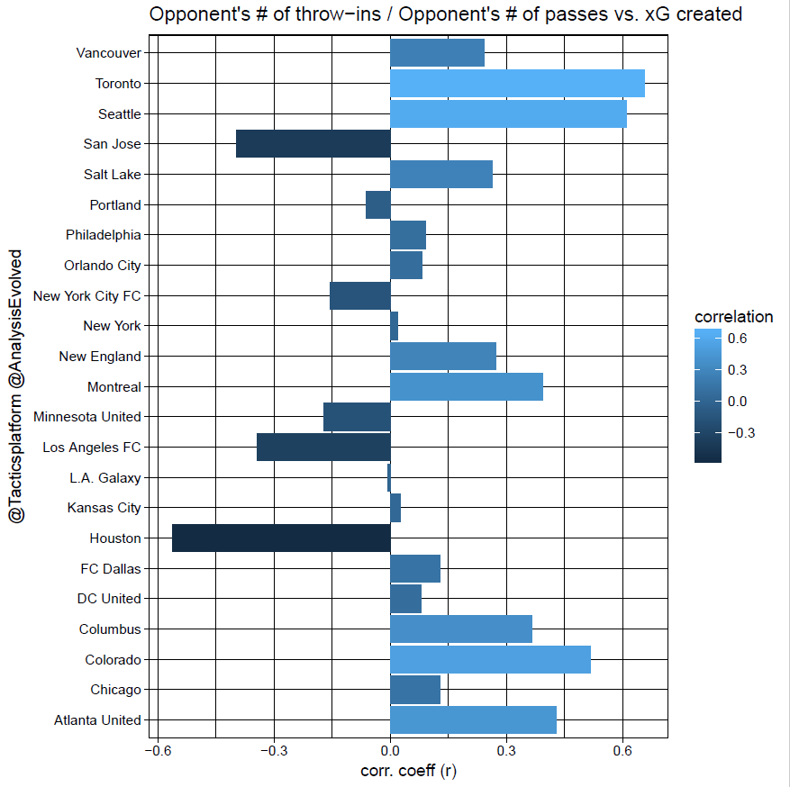
A correlation plot of the frequency of opponent's throw-ins and xG a team creates for every team in MLS.
For Toronto, when they allow a high ratio of opponent throw-ins to total passes, they create more expected goals. Houston creates fewer expected goals when they allow more throw-ins.

A correlation plot of the location of opponent's throw-ins and xG created a team creates for every team in MLS. Note that a negative correlation coefficient means that the CLOSER a team's opponents have their throw-ins to their goal, the more xG a team creates.
This means that Minnesota creates more expected goals when their opponents take their throw-ins from far from Minnesota's goalline. Conversely, Dallas creates more when they allow their opponent's throw-ins closer to Dallas' goal.

A correlation plot of the frequency of opponent's short pass success in the mid-third and xG a team creates for every team in MLS.
For most teams, allowing their opponents to have a higher percentage of long passes in the middle-third of the field leads to them earning more expected goals. For San Jose, Portland, New York, LAFC, LA Galaxy, and Houston, allowing more long passes in the middle third leads to them scoring fewer expected goals.

A correlation plot of the fraction of opponent's long passes in the defensive third and xG a team creates for every team in MLS.
When Philadelphia allows their opponents to complete a high percentage of their short passes in the middle of the field, they tend to get fewer offensive chances. When LAFC lets their opponent pass in the midfield, they earn more chances.

A correlation plot of the location of challenges and xG a team creates for every team in MLS.
New England creates the most expected goals when they make their challenges far from their own goal. Chicago and San Jose's offenses are best correlated with challenges that occur closer to their own goals.
For most teams, a higher defensive line and higher defensive intensity positively correlate with xG, meaning better defensive pressure leads to better chances. For example, the farther up the field New York City FC carry out defensive actions, the better xG they create. For the Revolution, the more interceptions and tackles they amass, the better scoring opportunities they generate. But our analysis also shows that even though these indexes measure similar defensive behaviors, they have subtle differences between them; for example, while more tackles benefit Orlando City’s chance creation, more interceptions harm it. Therefore, tackle and interception – even though both can regain the possession – signal different types of defensive behaviors.
Surprisingly, while having the highest defensive line and the most intensive defensive pressure by most measures, the Red Bulls don’t benefit from them; in seven of ten indexes, there is a negative or zero correlation between their defensive behaviors and xG. For example, increased tackling or forcing the opponent to play more long passes benefits 18 teams in xG, but not for the Red Bulls. Intensive defensive pressure seems to hurt them.
Maybe the Red Bulls merely haven’t optimized that particular tactic, or the stronger defensive pressure does benefit them, but they press too high. That notion is scary, considering they already have the 2nd highest points per game. Everyone else should worry.
But perhaps we are looking at the wrong direction. The traditional view of pressing focuses on possession dominance and transitional opportunities. But a pressing tactic can also influence other aspects of the game, such as speed and positional structure. When one team carries out more intensive pressing, it creates not only more transitions but also more possessions. As the number of possessions grows, there will be more exchanges of the possession. All the back-and-forth increases the pace of the game because time is needed for the players to move into the proper positions, and the increased tempo can also hamper the development of any tactical structure.
Thankfully, we can measure most of these things. WLetI first define what a “possession” is; a possession is a sequence of uninterrupted – or if interrupted, the interruption lasts fewer than two seconds – action events (pass, dribble, shot…etc.). This definition is similar, but slightly different, from the pass sequence used on the site. After grouping a team’s events into the possession (or pass sequence), we can measure how different teams behave in and out of the possession.

A correlation plot of the number of possessions a team plays and xG a team creates for every team in MLS.
The Red Bulls create more expected goals when they have more possessions. Atlanta creates more expected goals when they have fewer possessions.

A correlation plot of the number of possessions a team's opponents plays and xG a team creates for every team in MLS.
Similar to above, NYRB create more expected goals when their opponents get fewer possessions. Houston and Atlanta create more expected goals when their opponents have more possessions.
New York Red Bulls excel in all of these measures; they have the highest number of possession (155.6, 13% higher than average). They are one of the fastest teams in the league (the average possession’s duration and the opponent possession’s duration: 9.21 seconds and 10.2 seconds, 1st and 3rd shortest in MLS). They play one of the simplest possession games (2.72 passes per possession, 16% fewer than average, 3rd lowest in MLS), and they force the opponent to play similarly (3.43 passes per possession, 21% fewer than average, 2nd lowest in MLS). The Red Bulls play fast and furious.
That lightning tempo and chaotic game flow benefit them. In fact, it is the most critical factor in helping New York's chance creation; the correlation coefficients between the number of possession – or their opponent’s– and xG are both close to 0.9, higher than any other measure for any team. The Red Bulls have a unique advantage; only Seattle Sounders FC have come close to New York with a correlation coefficient lower than 0.5 in these measures.
How does a fast and furious game suit New York? Such type of game drains the players. All those possession exchanges mean every outfield player needs to run back-and-forth. The more they do that, the more exhausted they become. Is this why Jesse Marsch often stresses endurance training? The dots finally connect; the Red Bulls have the best stamina. They are fitter than anyone. They thrive as the tempo turns fast and the game becomes chaotic.
If that suggestion is right, we will expect that the Red Bulls perform, or maintain their performance, better than other teams. We can try to measure that behavior; I first analyze the fraction of a team’s xG in the last 15 minutes. The Red Bulls are one of the best teams in this aspect:

A scatterplot of a team's goal differential and xG a team creates in the last 15 minutes of the game for every team in MLS. For the goal differential, a positive number indicates a team is leading the game (goal scored minus goal conceded).
About 32% of their xG (2nd highest in the league) comes in the final 15 minutes of a game . Only Chicago Fire and D.C. United have a similar distribution of xG, but both teams have a negative average goal differential (GD) at that point, meaning that they are losing (and chasing) the game. They need to increase xG to avoid losing. In contrast, the Red Bulls have the highest GD at that point. They have no need to improve scoring but they keep creating chances.
They also lead MLS in other performance indexes in the last 15 minutes of the game:

A scatterplot of a team's dribble and pass success in the last 15 minutes of the game for every team in MLS
They have better (compared to their average per game) pass success rate and dribble success rate in the final period. Only Montreal Impact have a better pass success rate during this period. No team comes close to the Red Bulls when we consider all three indexes together.
Therefore, New York Red Bulls are the fittest and most enduring team in MLS. They tailor their tactics to take full advantage of that strength; they make the game so fast and random that they can exhaust their opponent’s energy and destroy it as the game enters the final stage.
The power and the limitation of the analysis
The Red Bulls have a superficially strange relationship between their defensive pressure and their offensive performance. They are the best pressing team and hold the highest defensive line in MLS, but the higher and stronger they pressure the opponent, the worse chances (xG) they create. Most analysts argue that the pressing tactic prevents the opponent from entering the offensive phase. It traps the opponent in the transition phase, where it is most vulnerable for the counter-attack. Our correlation analysis does not support that the Red Bulls are maximizing these transitional opportunities to create chances. Instead, they use pressing to generate more back-and-forth possessions and exhaust the opponent’s stamina. The Red Bulls use their better endurance to bully the opponent. Their performance indexes in the last segment of the game support this tactic.
Deciphering the effect of such tactic would be difficult with traditional analysis; most tactical analyses focus on using the video highlight and the game flow to demonstrate what any team is trying to do in a match. Dissecting the tactical setup requires the demonstration of the positions of the players and the structure they produced. But the Red Bulls’ tactic doesn’t need a structure. In fact, they want to disrupt most structures to make the game as chaotic as possible. Any strategy/tactic merely is a method to gain an advantage, and we shouldn’t be surprised that some tactics require a lack of structure. A tactic like this will not be easily detected from the traditional tactical analysis.
Except for the Red Bulls, we also predict that for most teams in MLS, holding a higher defensive line or increasing the defensive pressure helps them to create better chances. But how does that interaction happen? This question raises many important issues for soccer analytics. First, how exactly does the position of the defensive line impact the creation of chances? We can merely argue that retrieving the possession closer to the opponent brings a team closer to the opponent’s goal. But how high a defensive line should a team hold to optimize chance creation? The difference between the team with the highest (New York) and the lowest (San Jose) defensive line is about 11 yards (10% of the pitch). That is the largest difference between any two teams in this measure. How can such a small difference impact the creation of chances? If we look at the number of tackles, the largest difference between the team with the most and least fewer than ten tackles with a normalized amount of possession. Again, a small difference has a mysteriously significant impact. And this butterfly effect applies to the other measures such as the long pass ratio or the short pass success.
Perhaps we are looking the game the wrong way if we consider all the actions or events together; the average number of passes is about 470 while the average number of tackles is about 19. That small number of tackles can’t have a massive influence on the performance of passes. But once we group all the passes into different possessions (or pass sequences), we reduce that number of groups into about 150 possessions per game, meaning we are increasing the influence of each tackle (which usually only happen once in a possession) more than three-fold. The importance of all those actions with small numbers now makes become obvious.
But we still have 150 possessions per team per game, and we don’t know how to measure the importance of most possessions; for example, the correlation analyses here pre-selects all the outcomes with a positive xG. Each team has an average of 19 shots per game, and therefore, a maximum of 19 possessions end with shots (some posessions contain multiple shots). Analyzing the performance of a team with xG means we are discarding the other 130 possessions. We are not looking at what a team is trying to do the majority of the time. We only measure its performance when it almost achieves its goal (to score). We don’t have a complete description of the game.
What about creating an xG value for all possessions based on where the location ends, but not whether it results in a shot or not? Doing that gives a better measurement of a team’s performance. Or even assigning an xG value for every action event. For instance, a tackle in the opponent’s box to regain the possession will have a stronger effect on chance creation than a tackle outside of the box to prevent an opponent’s shot. Separating events spatially will help, but assigning a value will give a quantitative measure of how they impact the game.